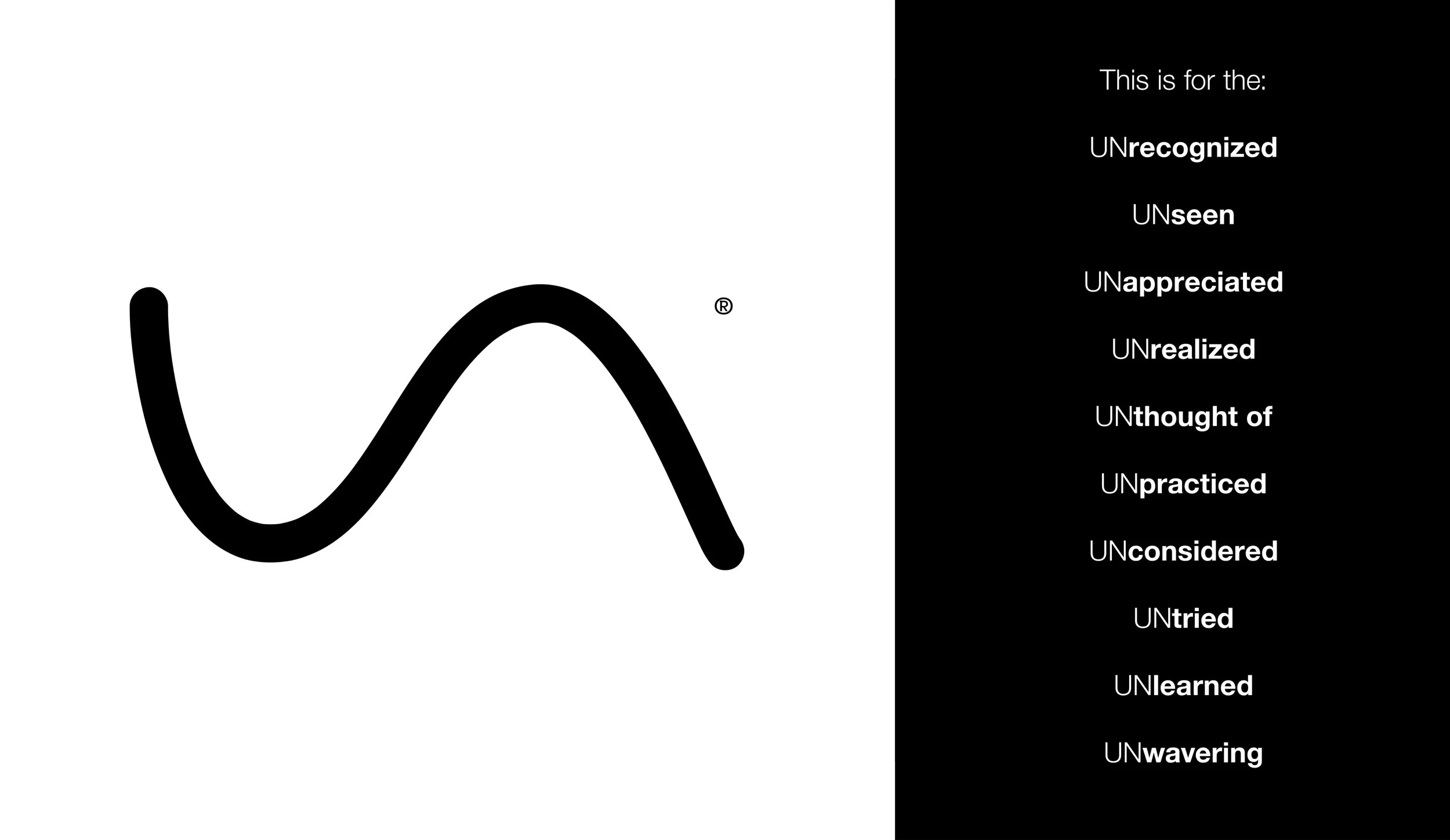
UNSUNG
Brand Creation
Problem: Sports branding all looks the same. Lion heads. Flaming letters. Chrome gradients. Meanwhile, the athletes who actually make teams win, the screen setters, the shot blockers, the back checkers, get none of the glory and none of the visual language built for them.
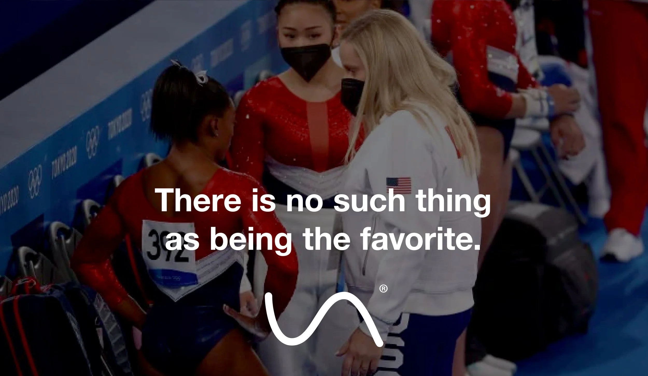
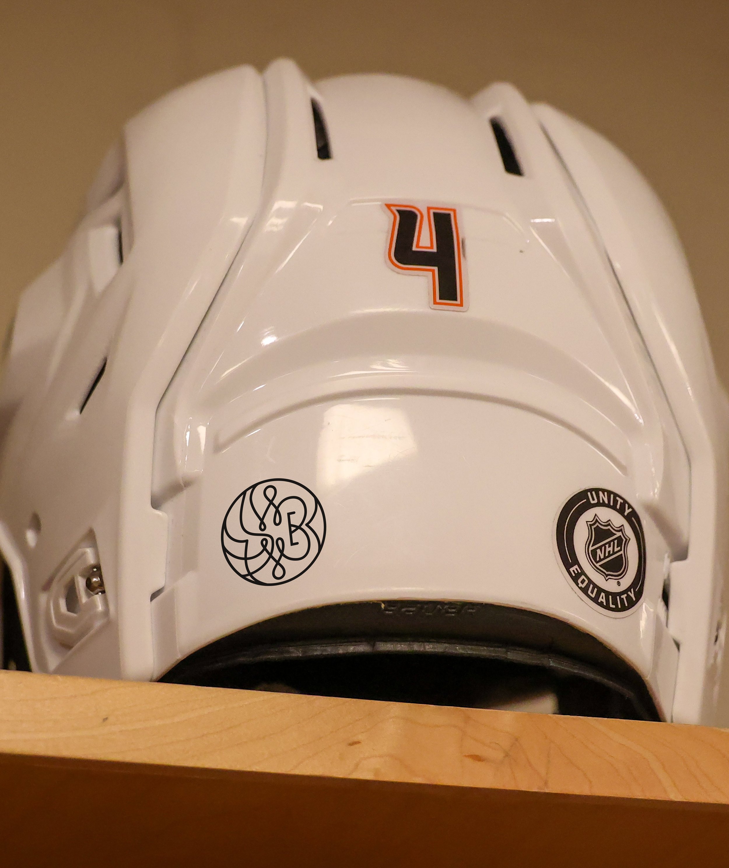
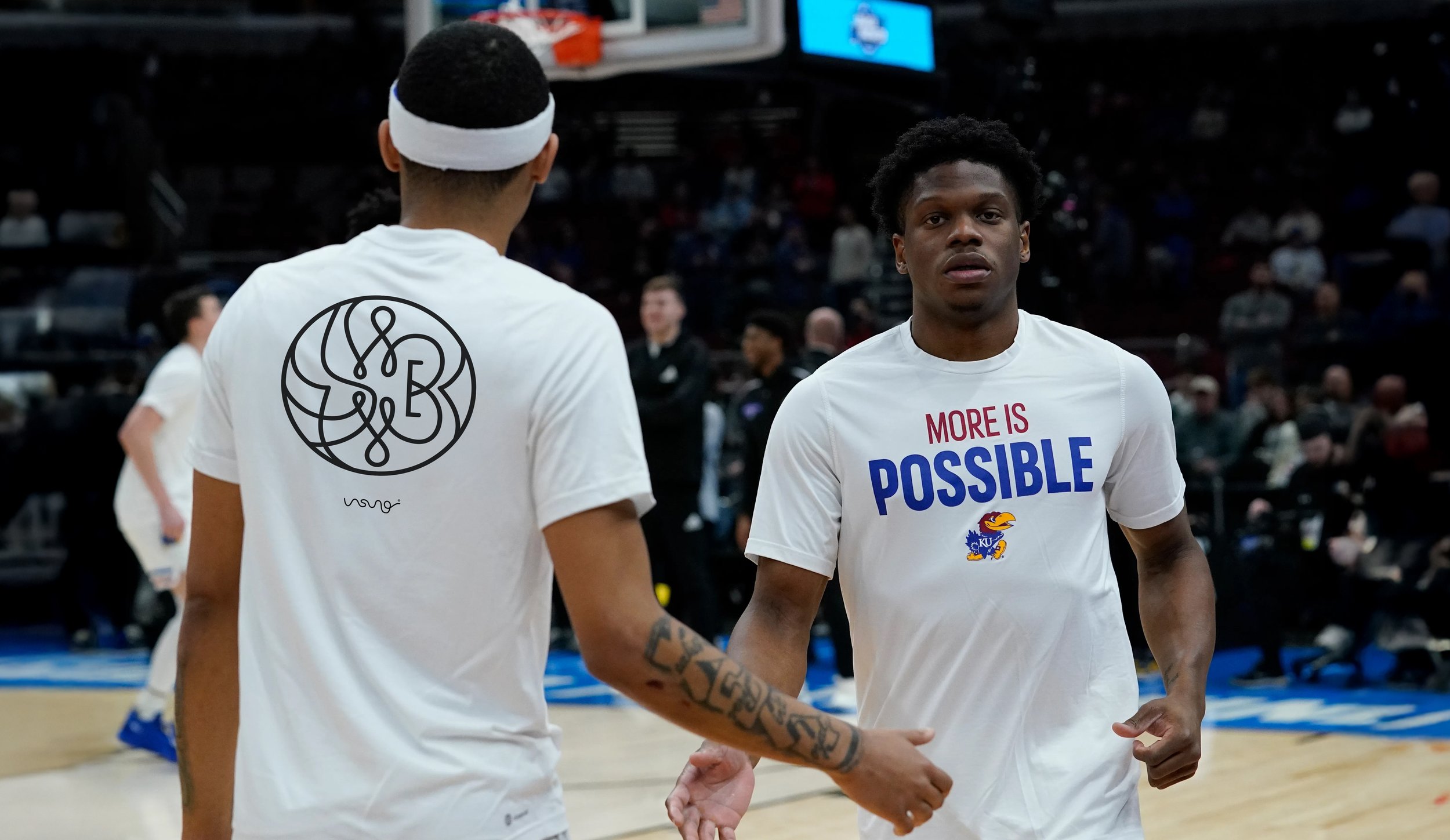
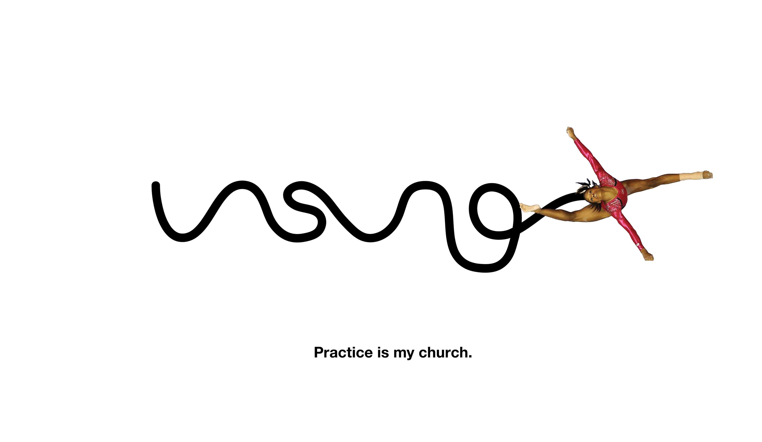
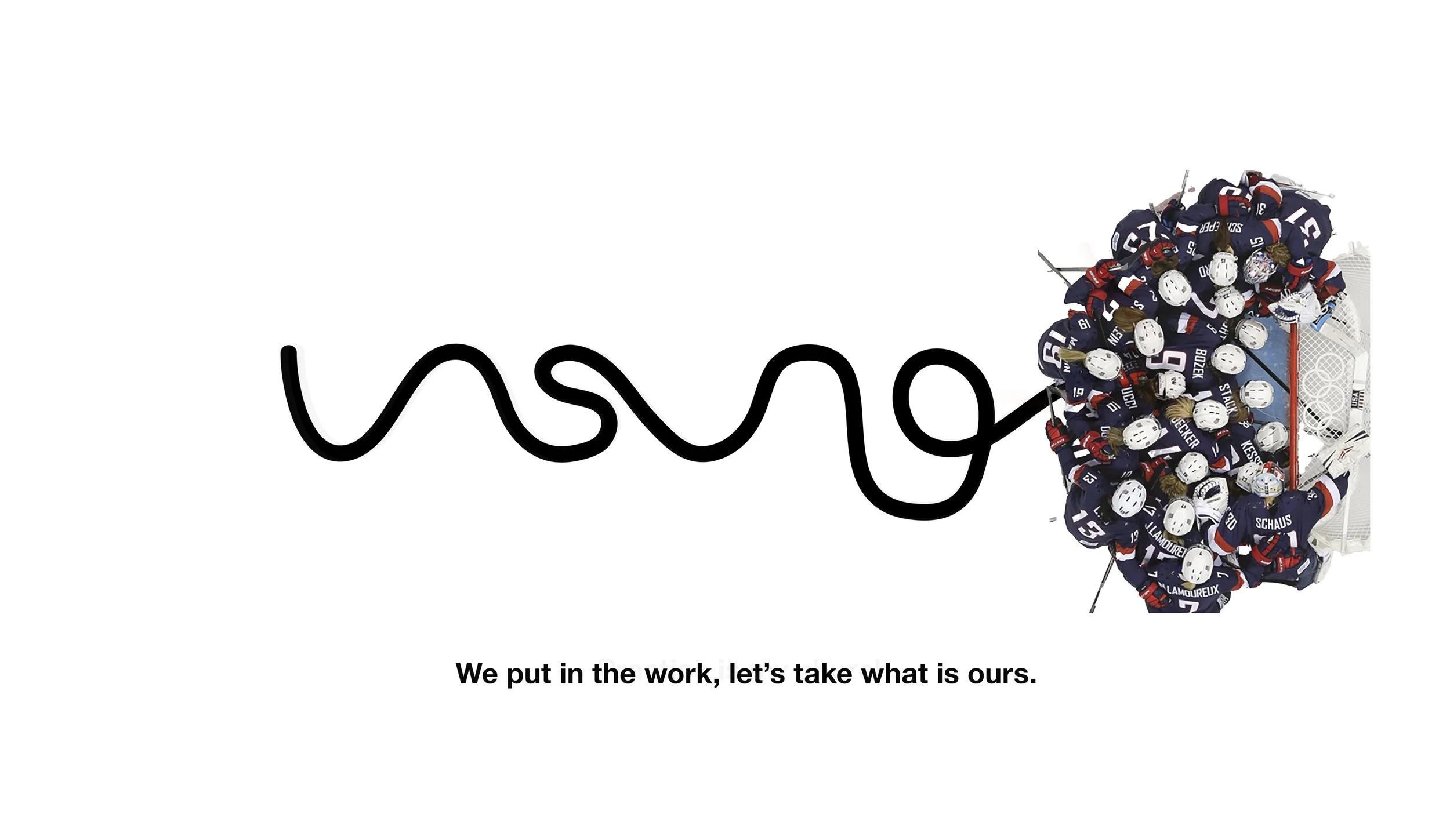
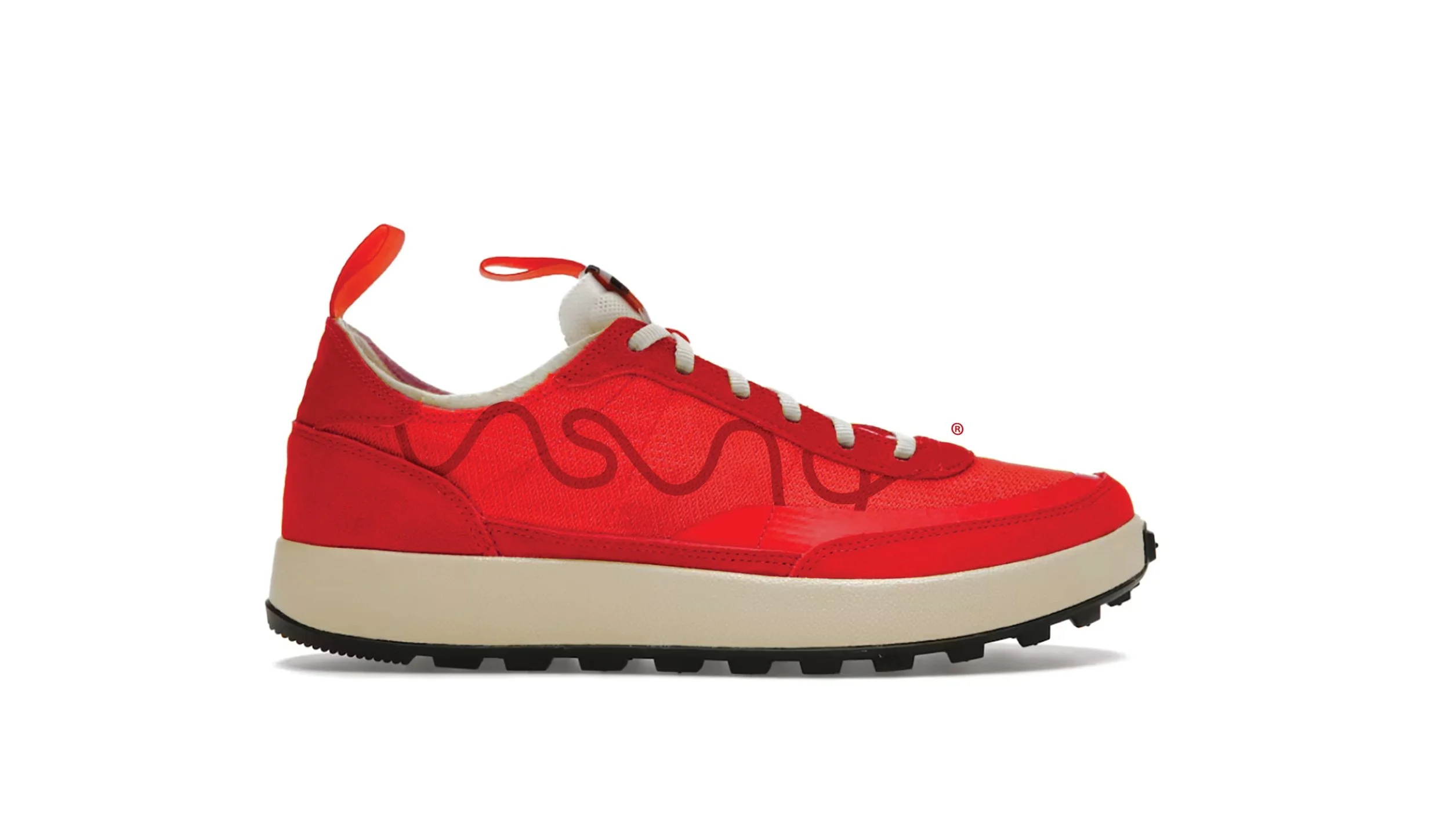
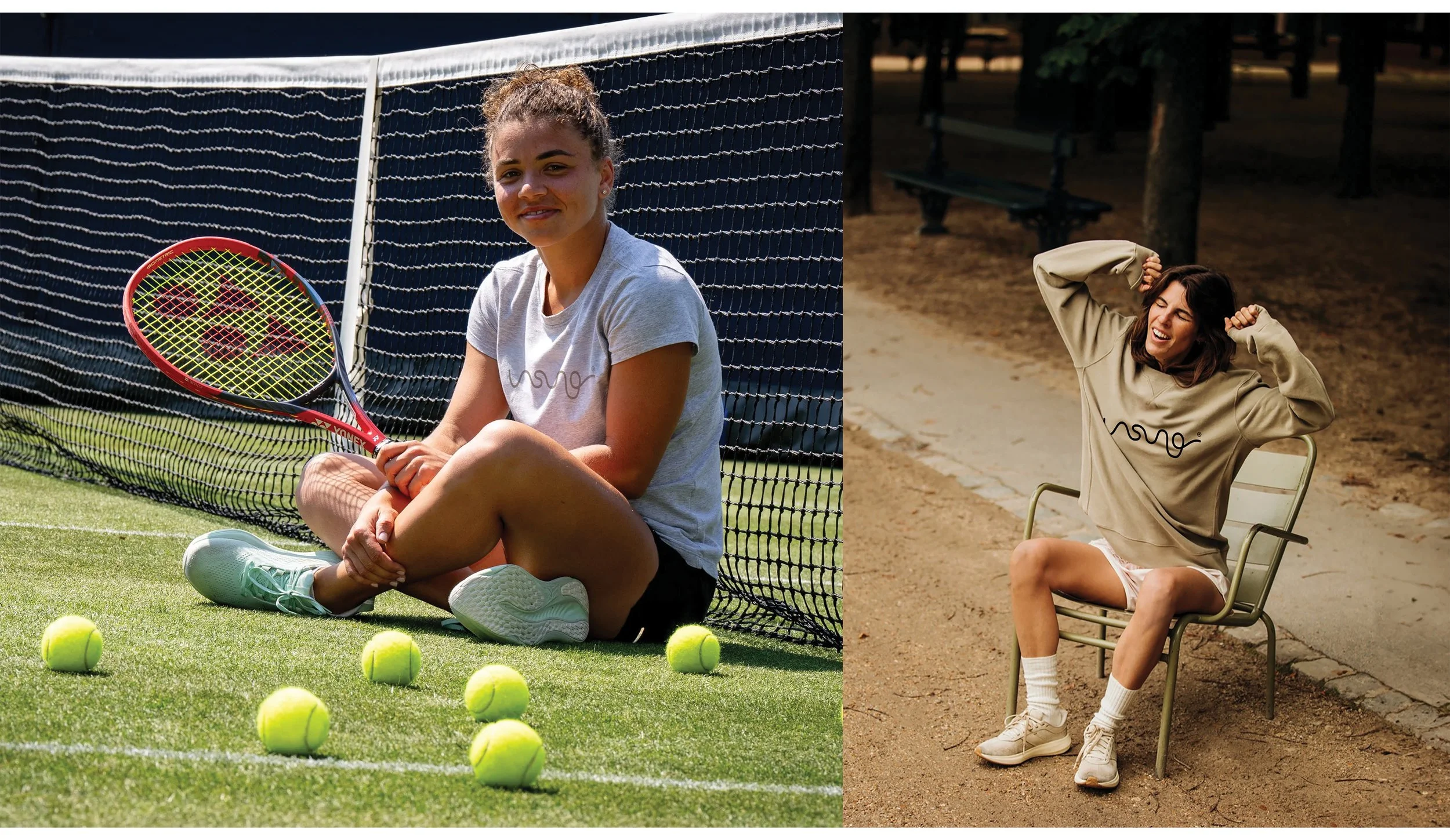
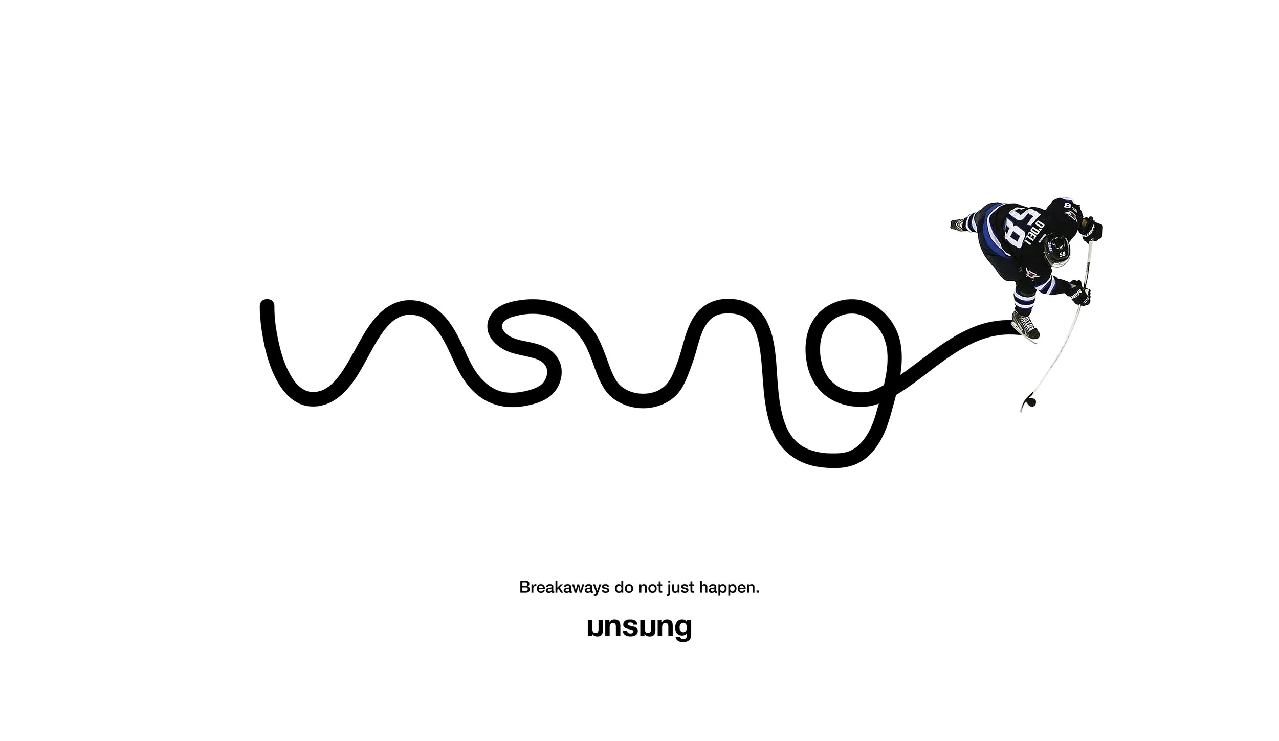
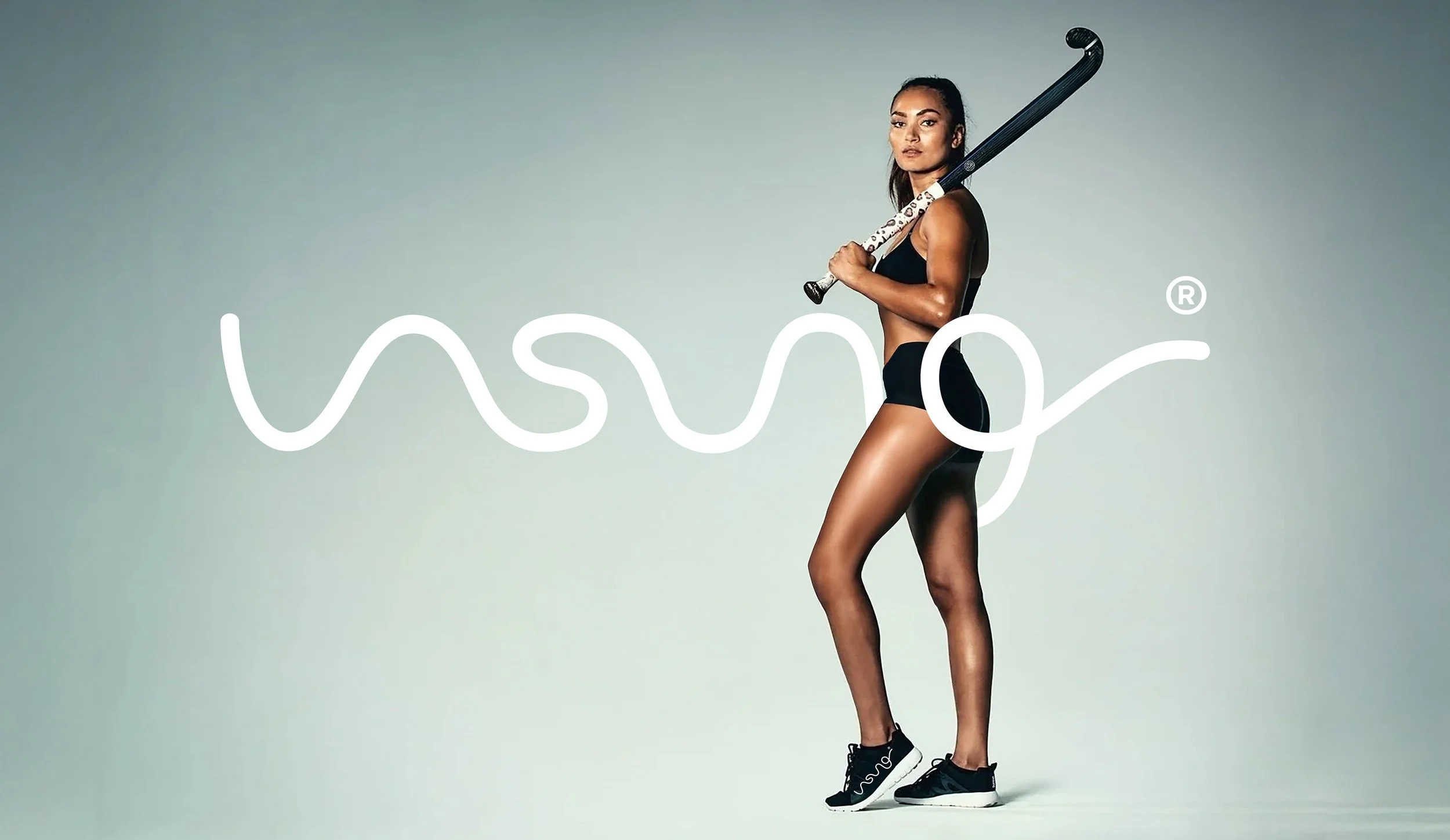
Solution:Unsung. A brand built entirely around team over ego. The logo is a squiggled script mark that reads as both the word and a literal path through chaos, capturing the rhythm and momentum of the game itself. Paired with a Helvetica system and a toolkit of diagrammatic strokes drawn from whiteboard symbology and coaching shorthand.
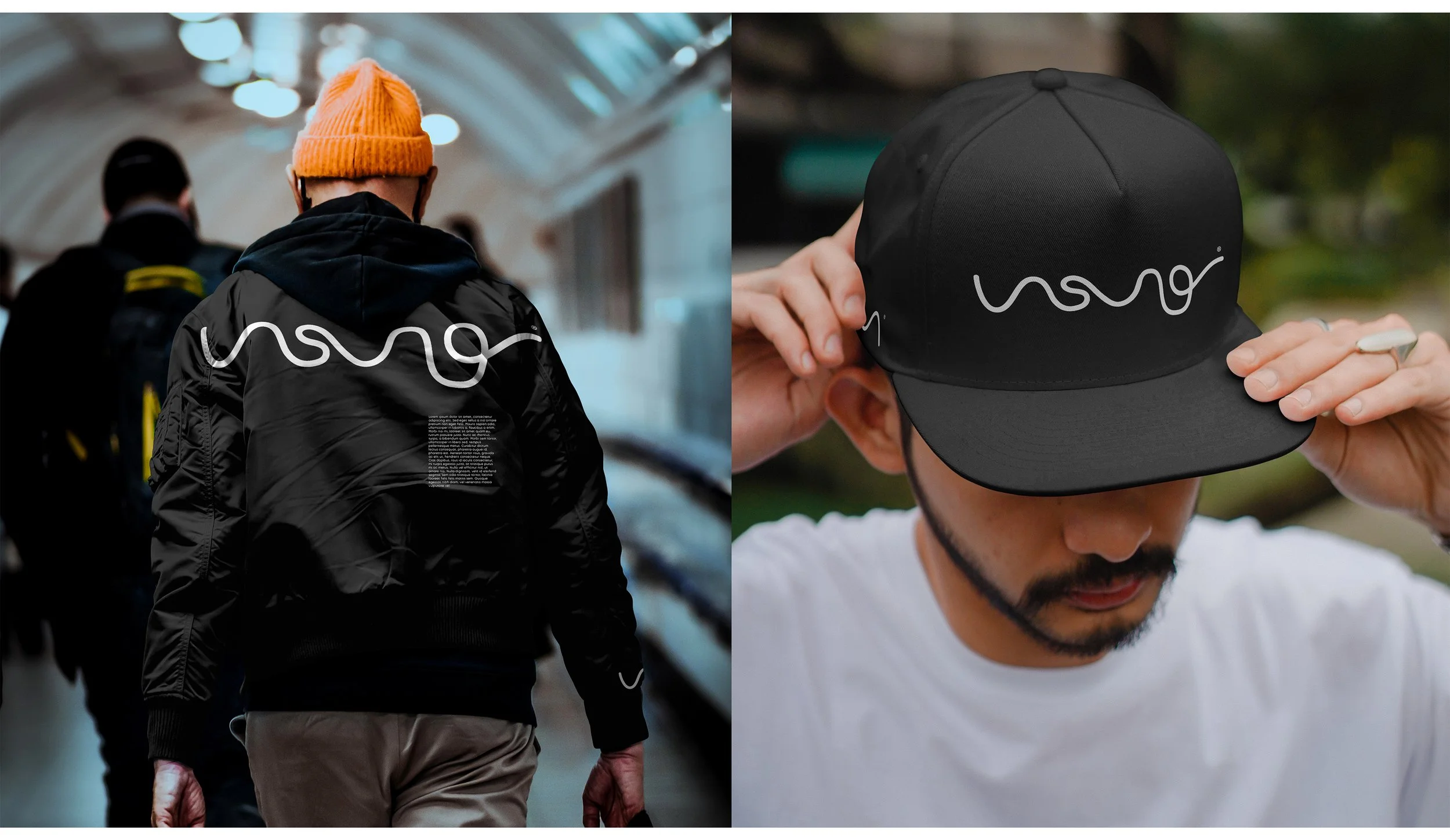
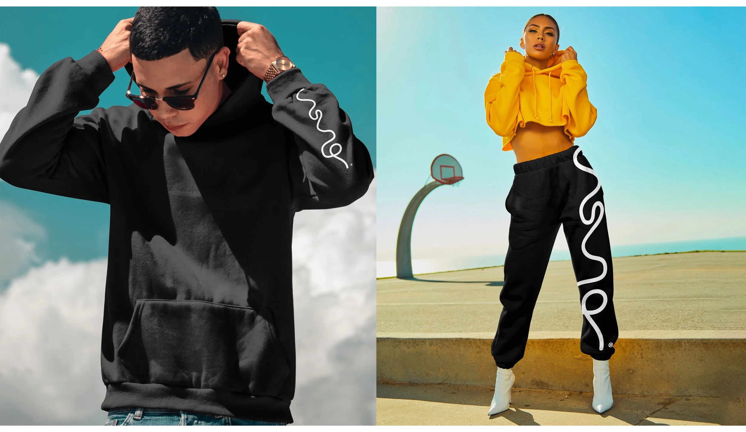
How: Full brand identity including logo design, typography system, graphic language, and campaign applications. Fast, humble, and sharp. Because breakaways don't just happen. Somebody made that pass.
This one's for them.