Branding is the art of creating clarity. Not decoration. Not style for its own sake. Real branding is structure, meaning, and identity built to last.
Every project here started with the same question: what does this company actually stand for? The answer becomes the foundation for everything. The logo, the system, the language, the experience. All of it working together. All of it saying the same true thing.
ACESO
Connected Hospital Technology
Problem: Aceso had been running on autopilot. The technology was solid, the idea was genuinely useful, but the brand looked 30 years behind the market. With a company sale on the horizon, looking outdated wasn't just an aesthetic problem. It was a valuation problem.
Solution: A complete brand transformation built around what Aceso actually does. Connected technology that links every department of a hospital to keep patients and caregivers informed. The new identity gave that idea a visual system, a clear story, and a market presence worth buying.
SIAA NXT
Insurance Distribution & Brand Architecture
Problem: SIAA had been building sub-brands for years with no visual cohesion between any of them. For a company managing 5,200 agencies and $17 billion in premiums, the fragmented identity made a complicated business look even harder to understand.
Solution: A parent brand identity with motion built into the logo itself, designed so every sub-brand can inherit the system and still feel distinct. One connected visual architecture that finally matched the scale of the business behind it.

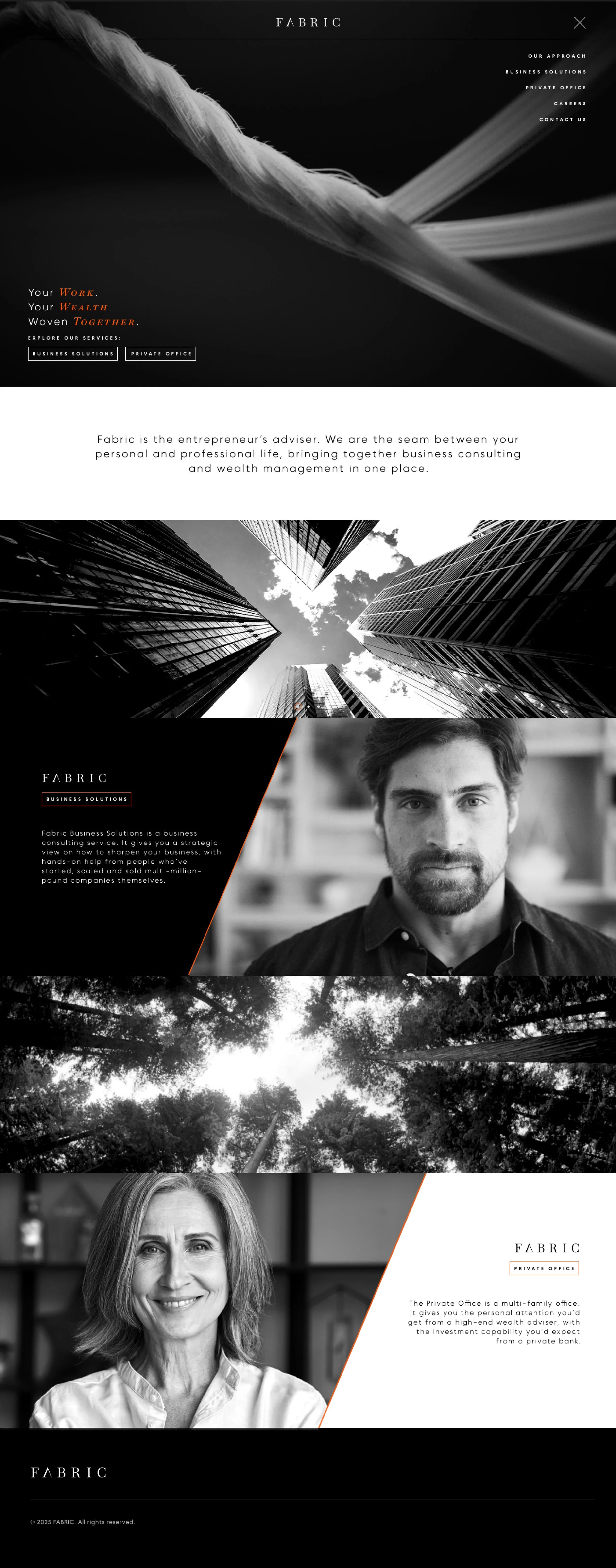
FABRIC
Wealth Management for the Self-Made
Problem: Fabric's existing logo was the result of too many opinions forcing meaning onto a bad visual idea. For a wealth management brand serving self-made entrepreneurs, the identity needed to walk into a room and command respect before anyone said a word.
Solution: A brand built on achievement, prestige, and restraint. The kind of identity that doesn't ask for attention. It assumes it. Work, family, and legacy as the clear pillars. A logo that changes the atmosphere of every room it enters.

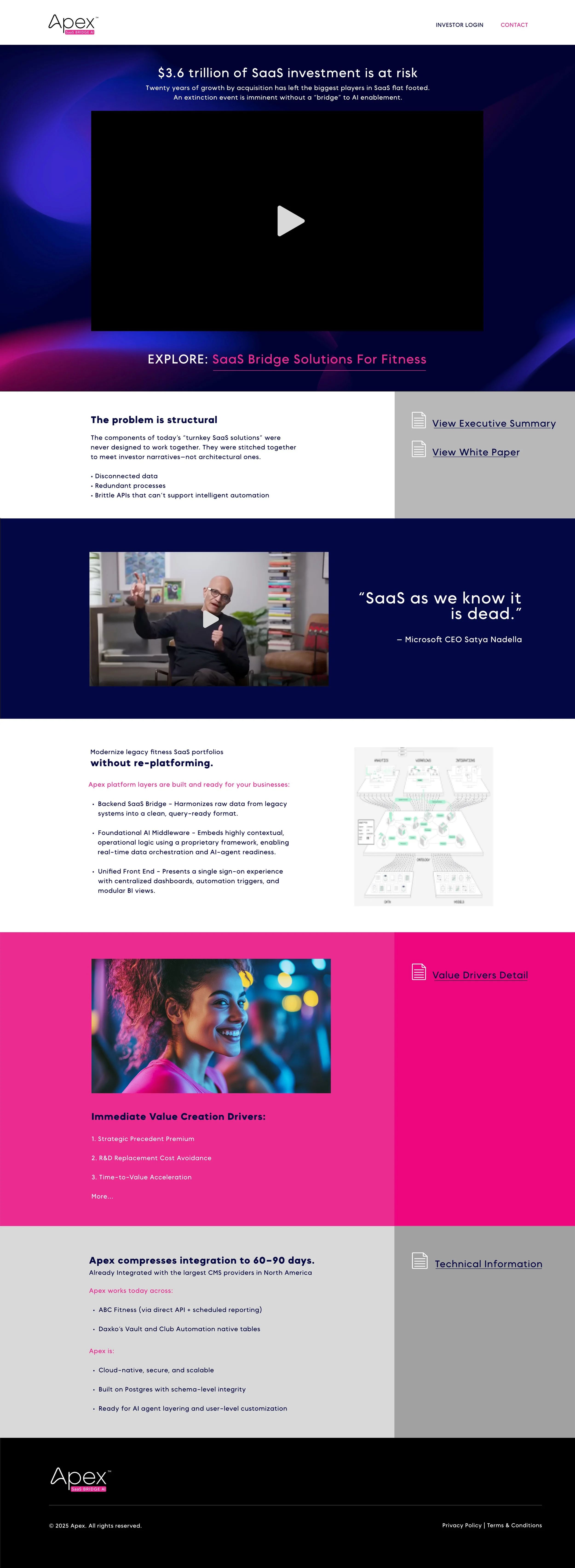
APEX OS
AI-Driven Fitness Management Software
Problem: Apex had a bold idea. AI-powered software that challenges the entire SaaS model in the fitness industry. The problem was they didn't look like a company that could pull it off.
Solution: A brand identity that made them look legitimate before the product was fully resolved. Because in early stage companies, credibility is the product. You have to look like you belong in the room before anyone will listen to what you're building.
CURBWISE
Home Services Brand, Austin TX
Problem: Airbnb homes sit empty between guests. Trash cans stay in the street for days. It's an eyesore, a security signal, and a problem nobody had built a simple service around yet.
Solution: A subscription service that takes your cans to the curb and brings them back. The brand was designed with one rule. Do the job only. No moodiness, no overthinking. Clean, clear, and exactly what it is. Know your audience.